 6 min reading
In an experimental project, our small team started from scratch, showed the company how to get results quickly, and changed how teams worked on the product.
Context
New leadership had joined the company. They were under pressure, and the holding company expected visible results quickly. A few managers and I were invited to lead the product transformation.
The designers worked in separate teams and rarely worked together. There was no shared design team structure or design system, and some user flows were inconsistent.
Birmarket
No updates for years
Outdated design and experience
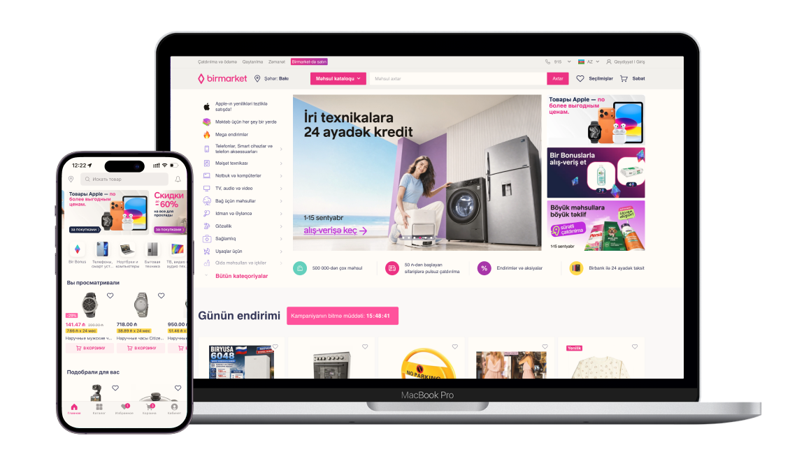
Business goal — fix unit economics
As sales grew, poor unit economics were leading to bigger losses.
My role
My task was to identify and address UX issues that directly affected the marketplace’s unit economics. My mandate included shaping product team practices, leading research, and drawing on analytics and customer support resources to inform product proposals.
Timing
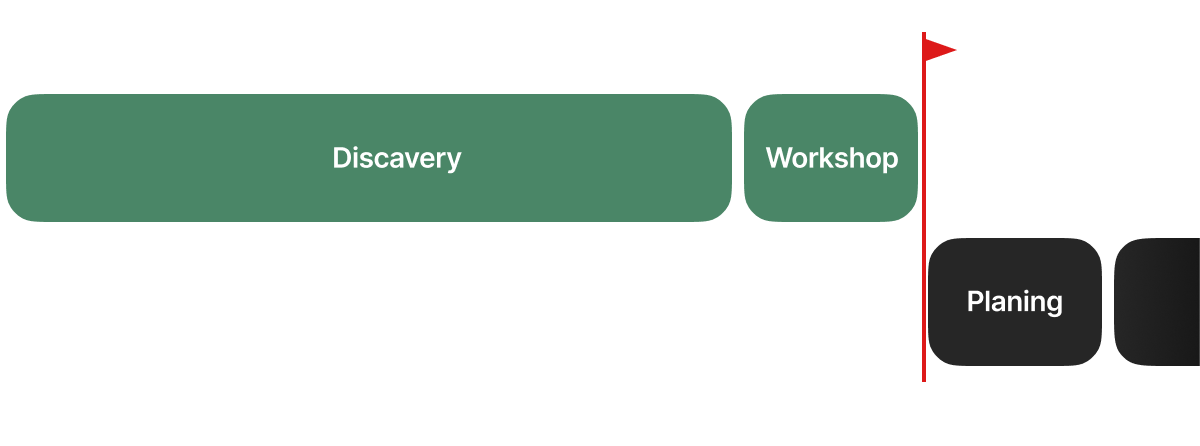
We agreed with leadership on two months of discovery so we could share our findings in time for Q2 planning.
Understand the problem
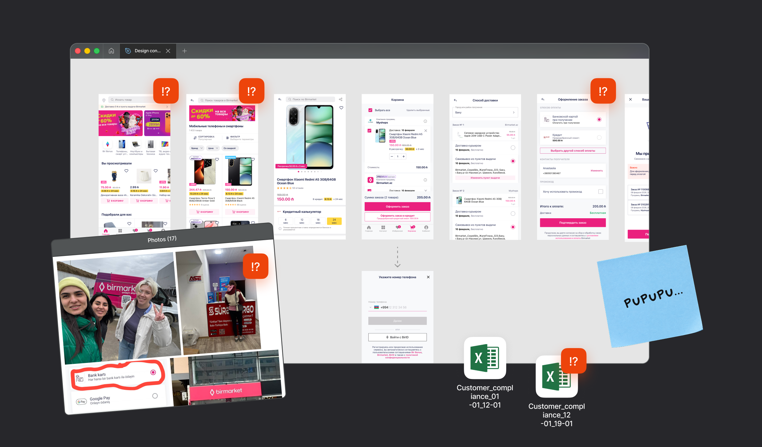
We reviewed the mobile and desktop experience. We combined product data with customer support questions, app reviews, social media complaints, earlier research, and interviews with product teams. Together with the research team, we also looked at how orders were handled at warehouses and pickup points to understand the full purchase experience.
Find opportunities
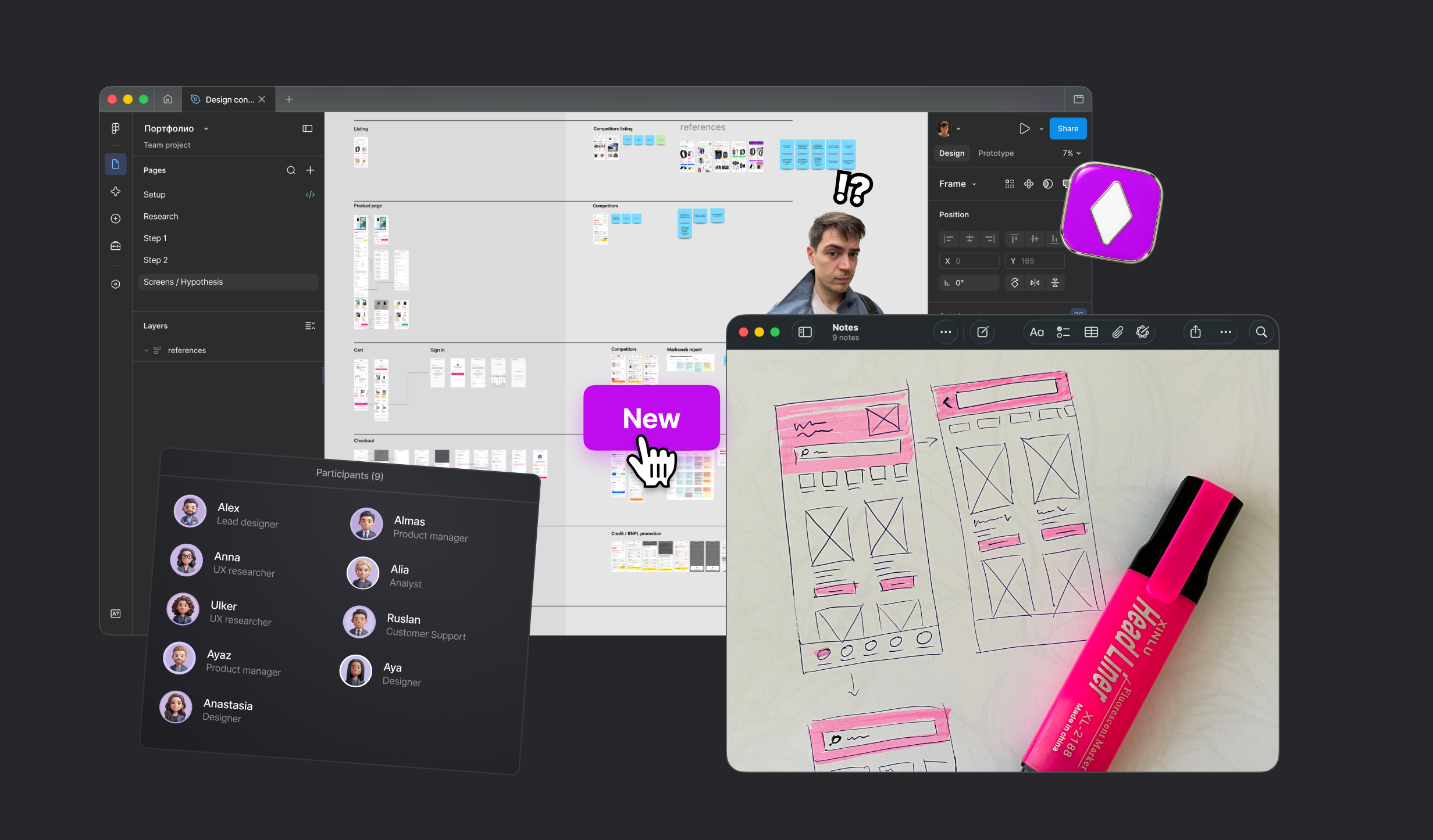
I brought the design team and a product manager together for a two-week design sprint. We turned the audit findings into ideas to test at key steps in the purchase journey. We estimated which metrics each idea could affect and built prototypes for the most important parts.
We worked in short cycles. A small group of users and customer support colleagues gave us quick feedback as we developed the ideas.
Test the ideas
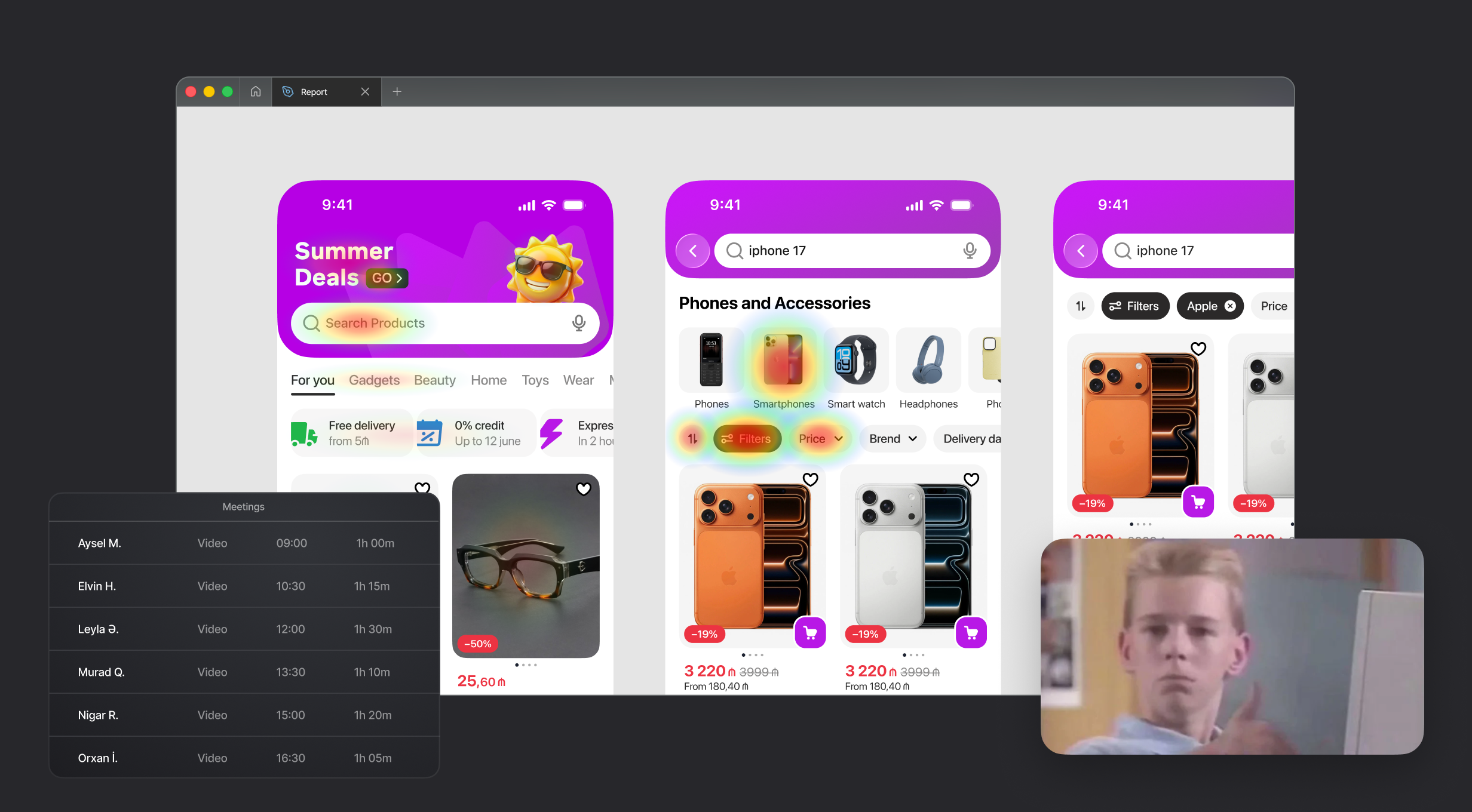
We built a prototype to address the problems we had found. We then ran qualitative research sessions with 12 participants to understand what they thought of our solution and what problems we might have missed. These sessions revealed details that the audit alone could not show.
Next, we tested the updated version with a larger group in a quantitative study that received 600 responses. This gave us stronger evidence about customer problems and our proposed designs for the next round of discussions.
Make trade-offs
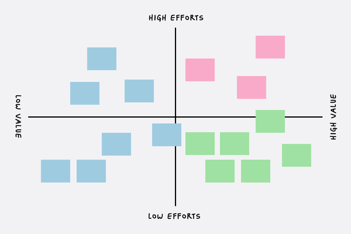
We wrapped up the project in two months and were ready to move into planning. We shared our findings with the wider team and then ran a workshop. We used an Impact–Effort Matrix to compare the value each idea could bring to customers and the business with how much effort it would take to build.
Plan the next steps
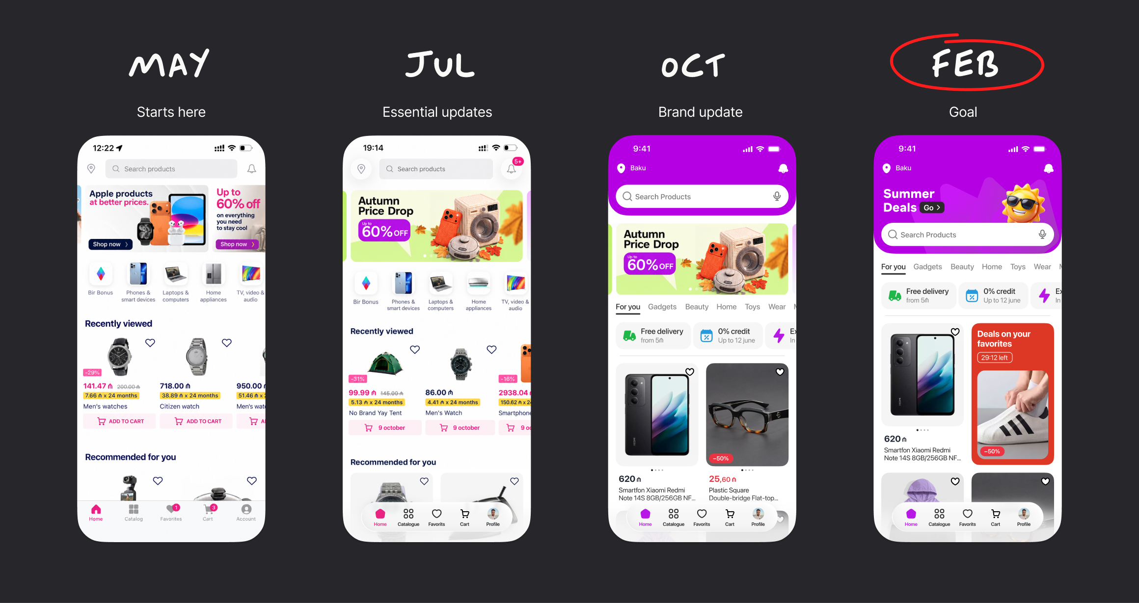
We presented our concept to leadership and gained their support. The team finally had a shared vision of where we were going. We agreed with the product team to introduce the changes in stages. The main sections of the app followed a similar structure. Most of these changes were planned for 2027.
Visual part
Alongside the research, I took full ownership of the new UI and a modest brand refresh. I worked with the marketing team on this. I proposed a new color that works better in digital and print, and set the direction for the graphic style.
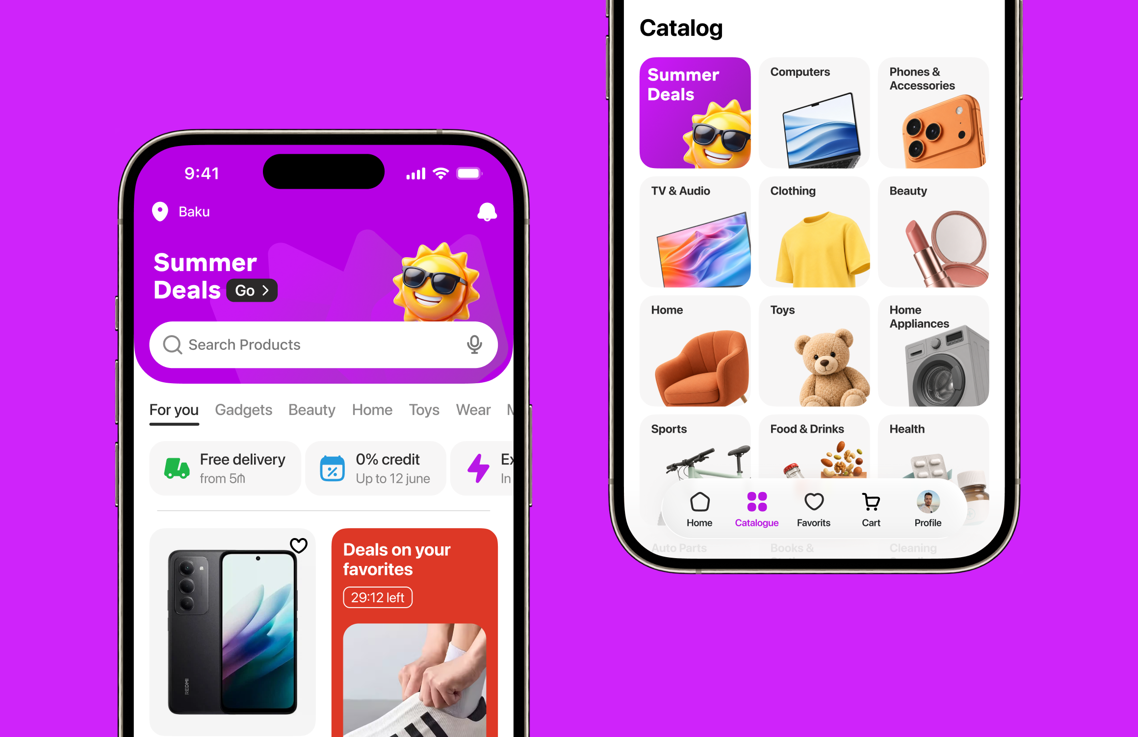
We prepared the first concepts for testing to see how users perceived them. We wanted to know whether they would recognize the new color. Together with the icon and graphic style, it made Birmarket unmistakable to them.
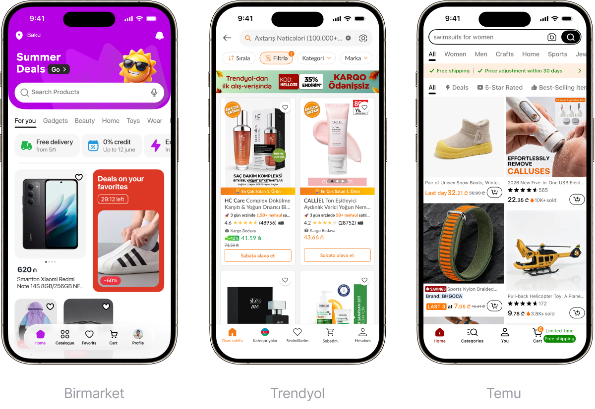
The new style helped us guide users’ attention in the app and distinguish the product from competitors, including Temu, AliExpress, and Trendyol.
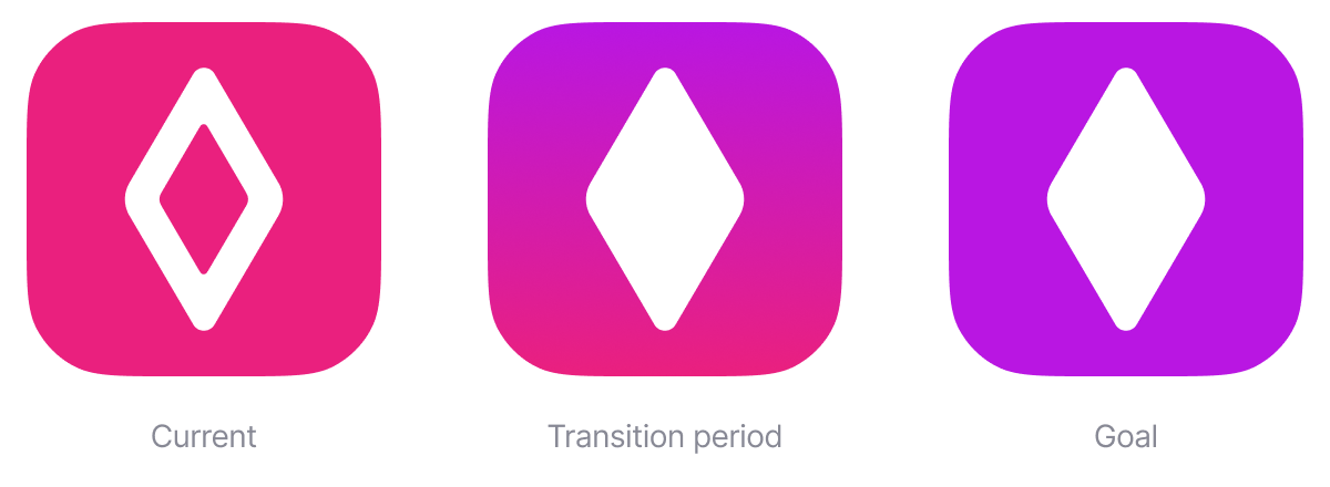
To make the change recognizable, we agreed on a transition period: pink would first appear in a gradient before the brand moved fully to the new color.
Measured results
This is a recent project, so I can’t share detailed results publicly yet. I’d be happy to walk you through the numbers in a conversation...
